 OUTTA THE BOX™BOOK A FREE CALL█OUTTA THE BOX™BOOK A FREE CALL█
Brand identity & collaterals for Dubai’s community Islamic learning centre — est. 2007, rebuilt around a single word.
A Dubai institution serving the community since 2007, wearing an identity that undersold its warmth and stature. We rebuilt the brand around its own name — the word.
Kalemah Islamic Center has been teaching, guiding and welcoming Dubai’s community — new Muslims and youth alike — since 2007. But its identity didn’t carry the weight of that history: it needed a brand as warm as its classrooms and as dignified as its mission.
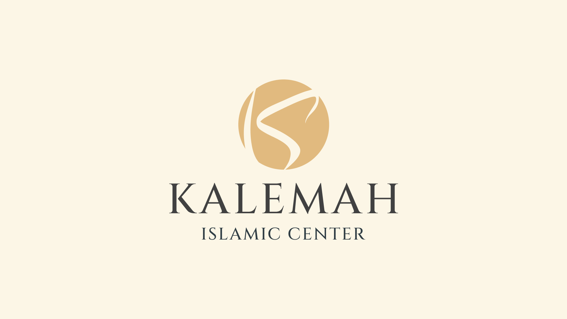
The name held the answer. Kalemah means “the word” — an echo of the kalima itself, the single sentence at the heart of the faith. The brand had to feel rooted in Arabic heritage, serene rather than loud, and equally at home on a lecture stream, a lanyard, a tote or the side of a bus.
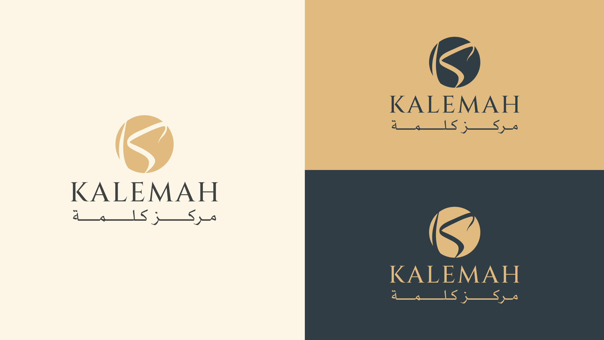
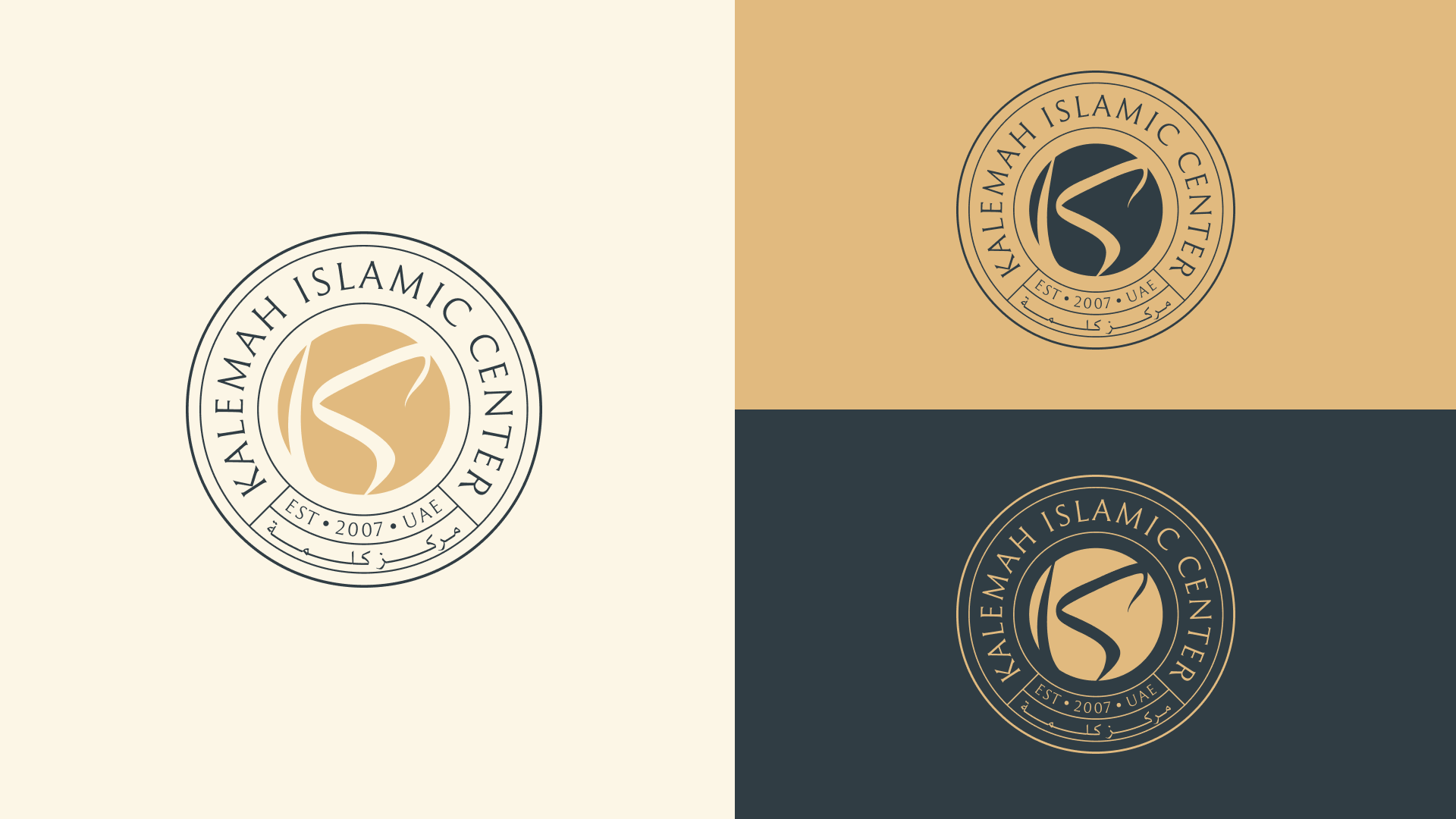
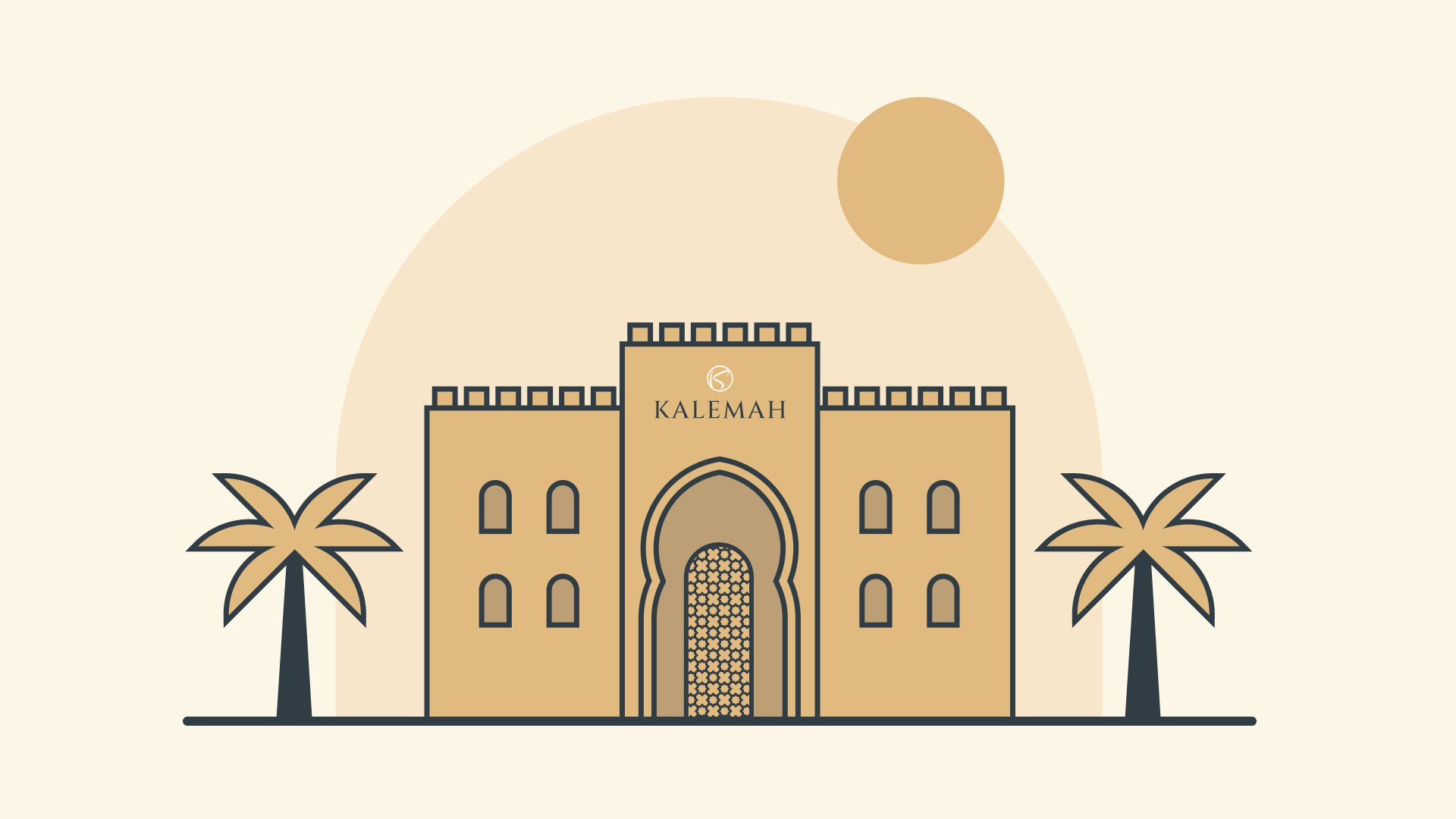
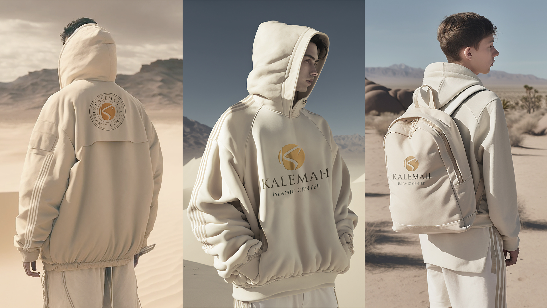
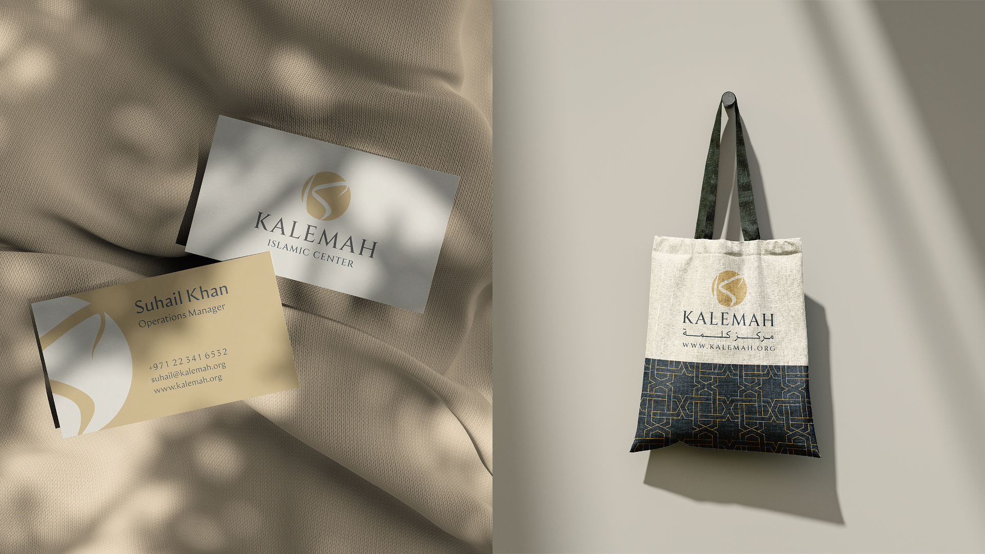
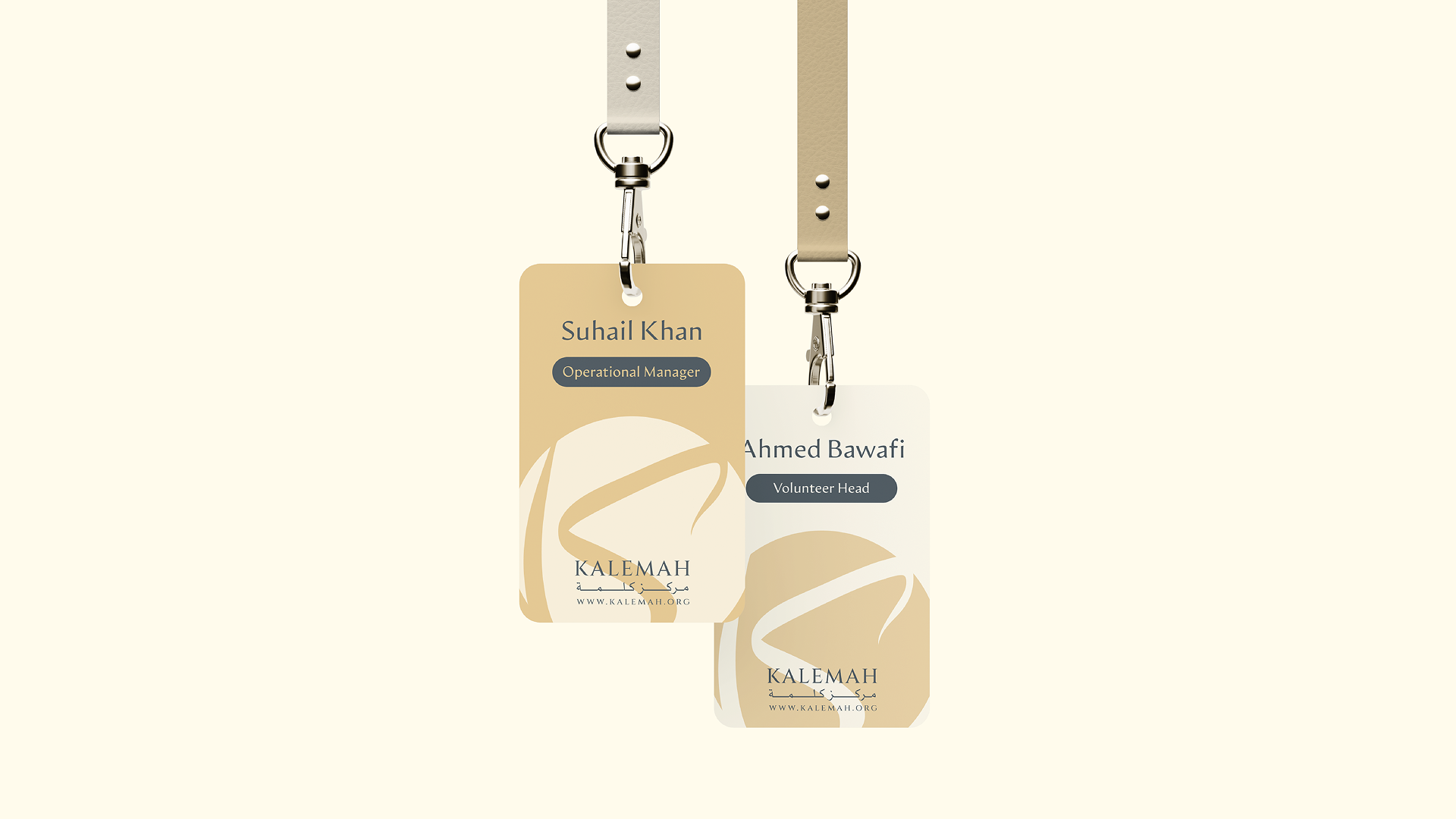
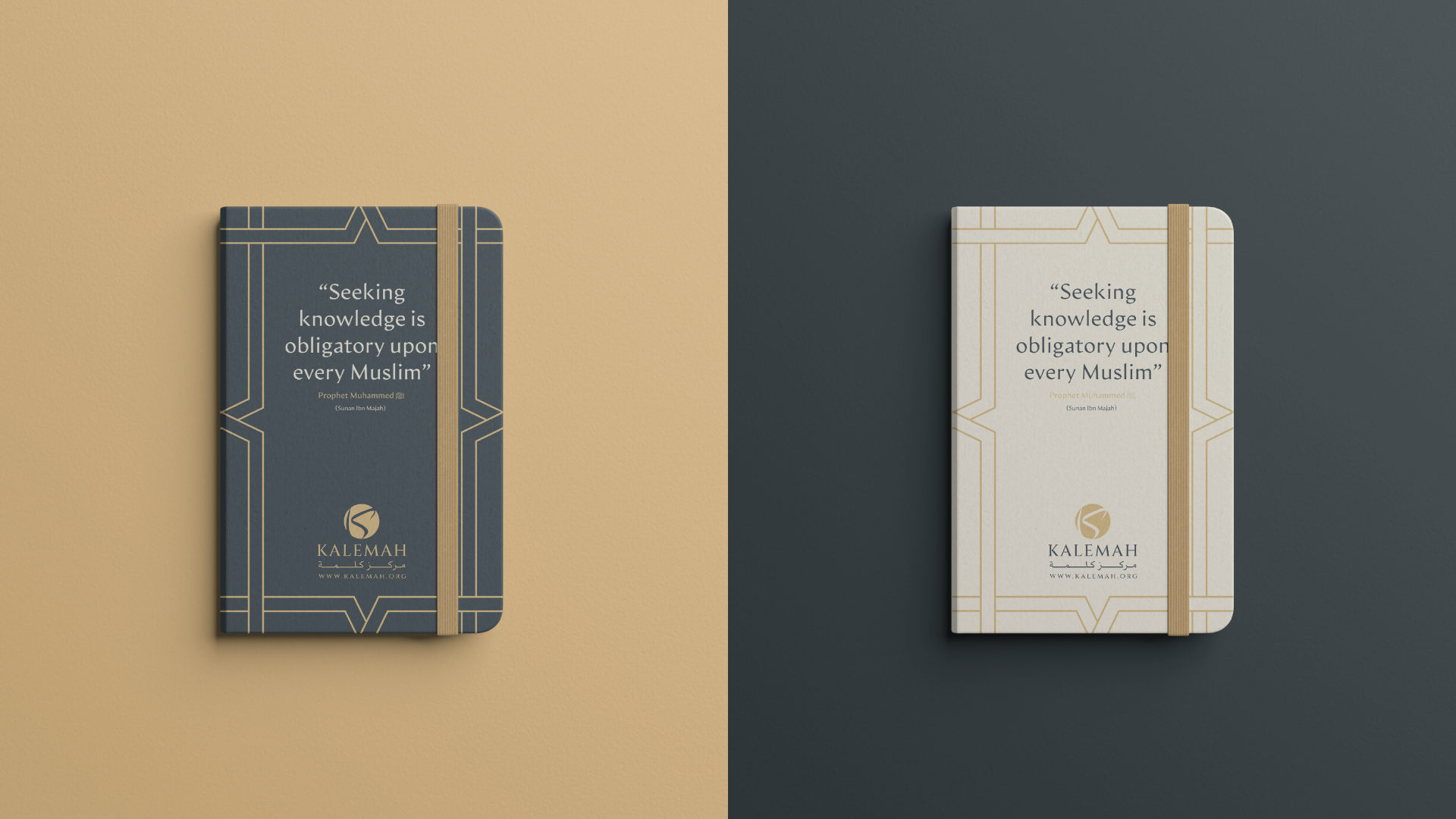
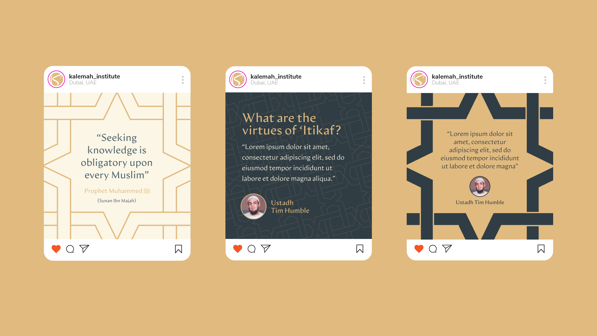
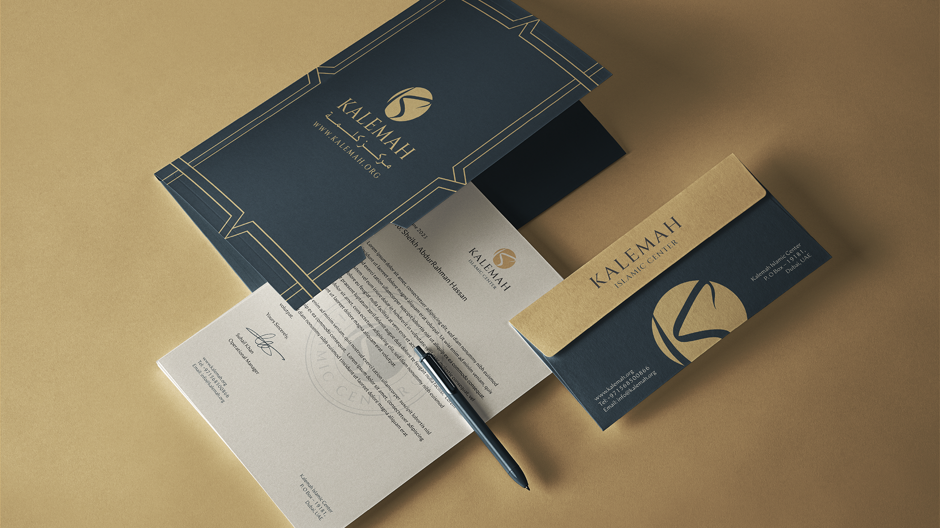
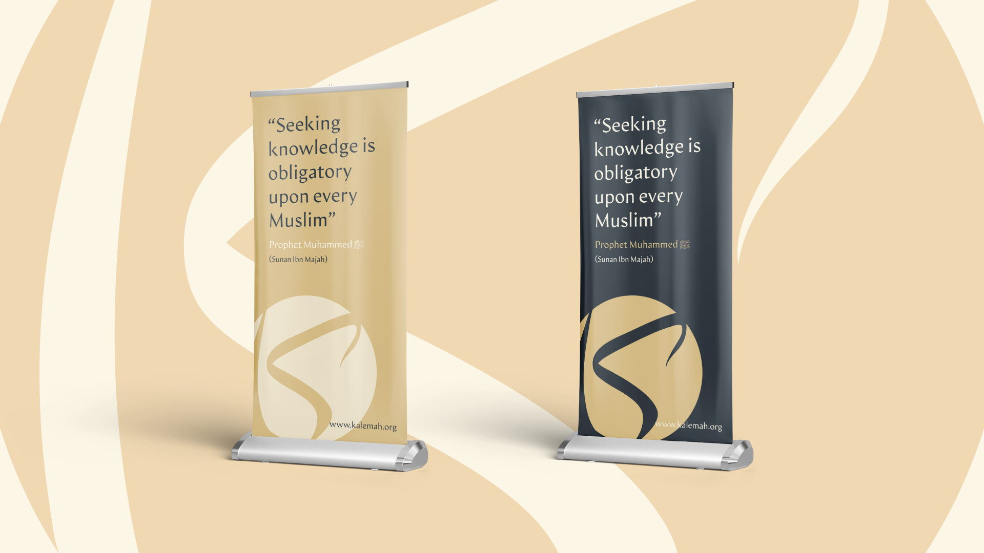
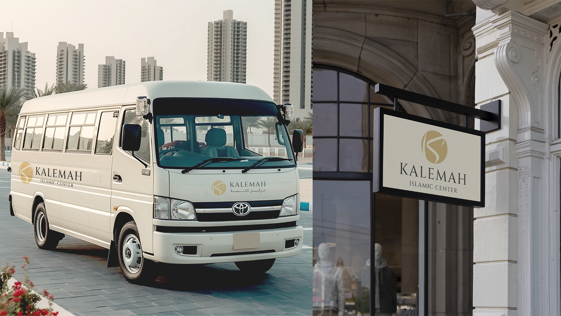
The K is drawn as a single calligraphic stroke inside a golden circle — Arabic calligraphy and the Latin initial in one gesture, echoing ripples of knowledge spreading outward. Around it: a desert palette of sand, cream and deep midnight blue, a classical serif, geometric star patterns, and a badge seal stamped EST · 2007 · UAE.
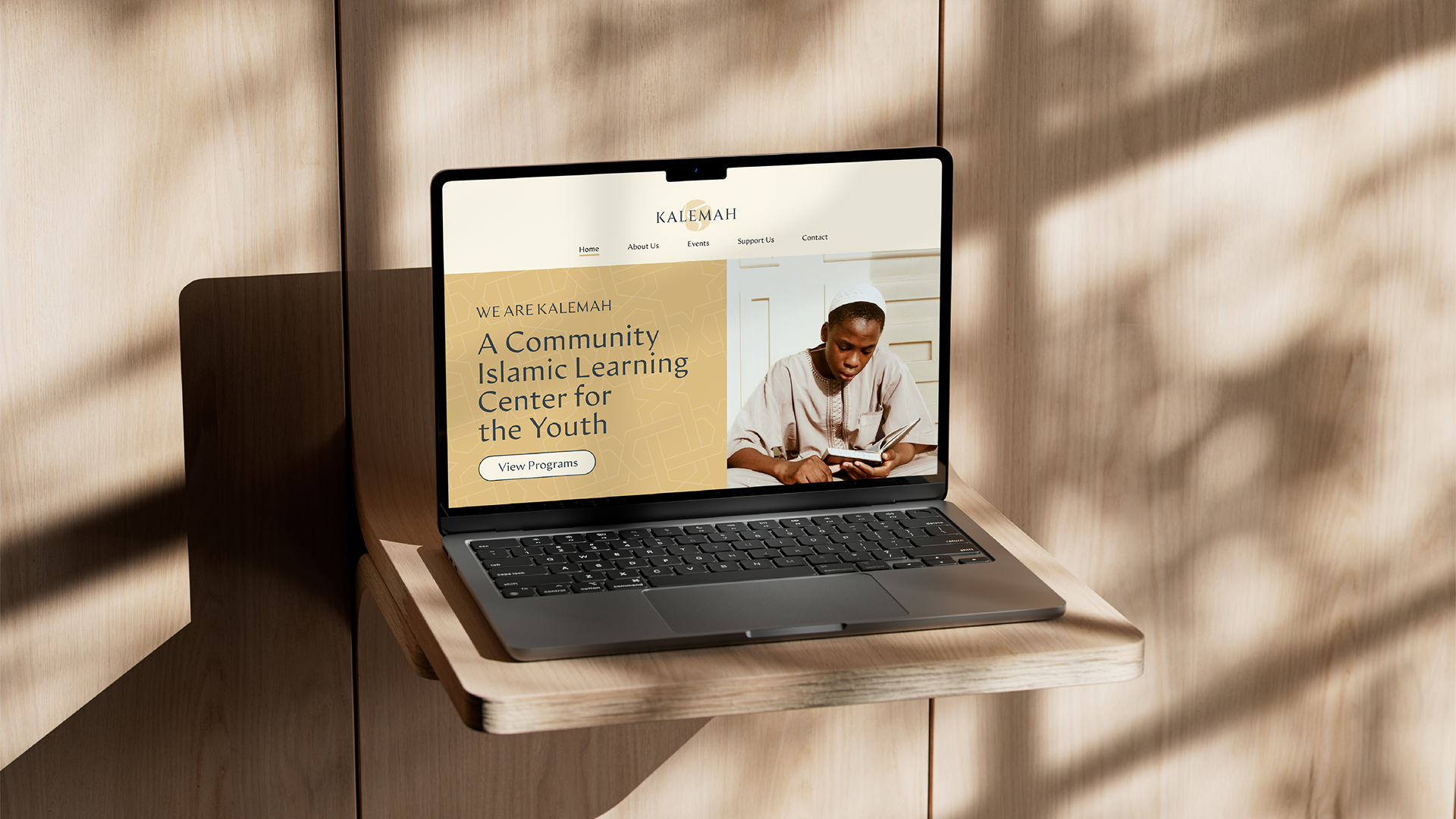
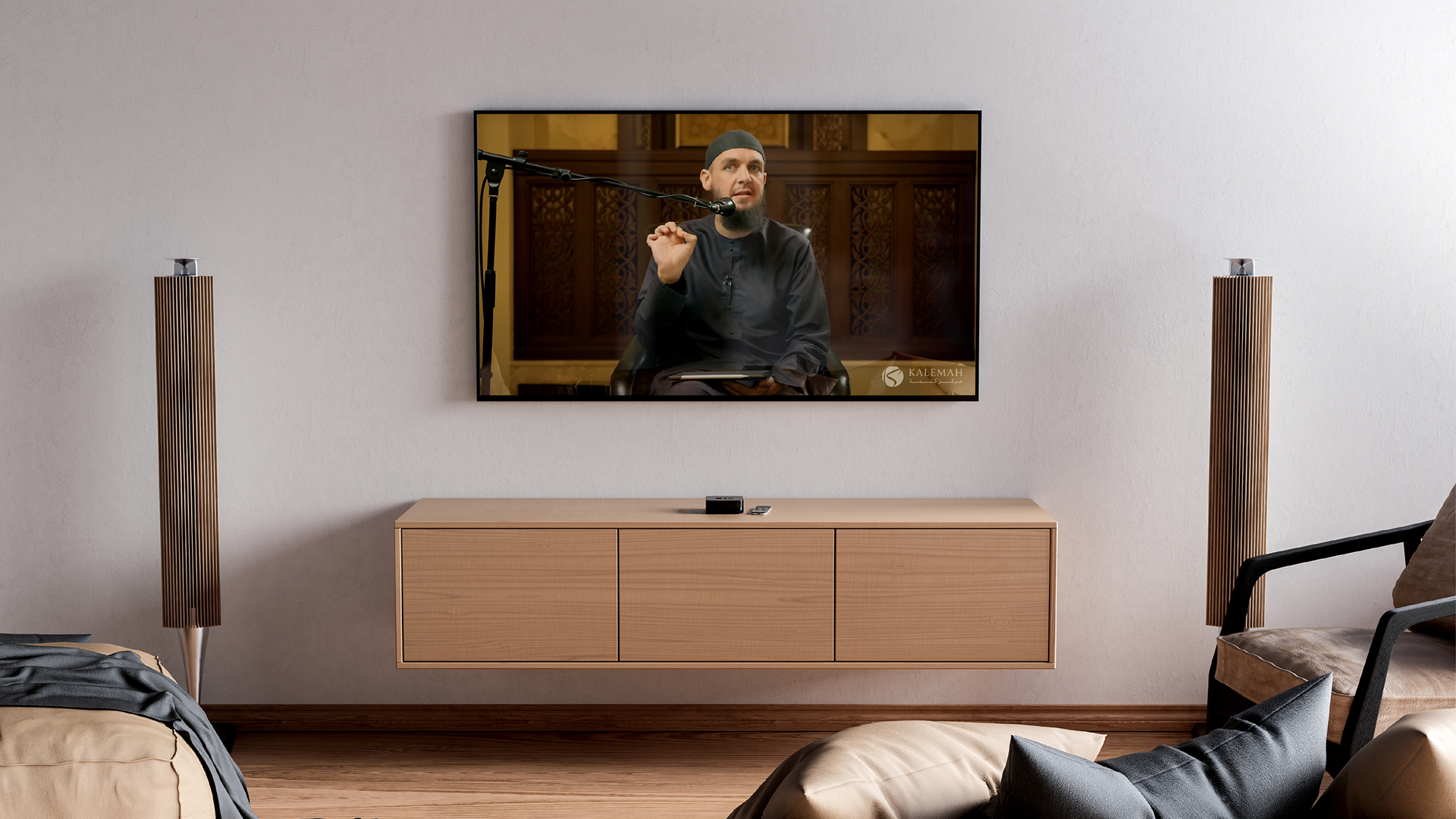
The system runs the full width of the centre’s life: stationery and letterheads, staff lanyards, notebooks, social templates, roll-up banners, stickers and pins, streetwear-grade merch, the community bus, street signage, the website and the lecture broadcasts.
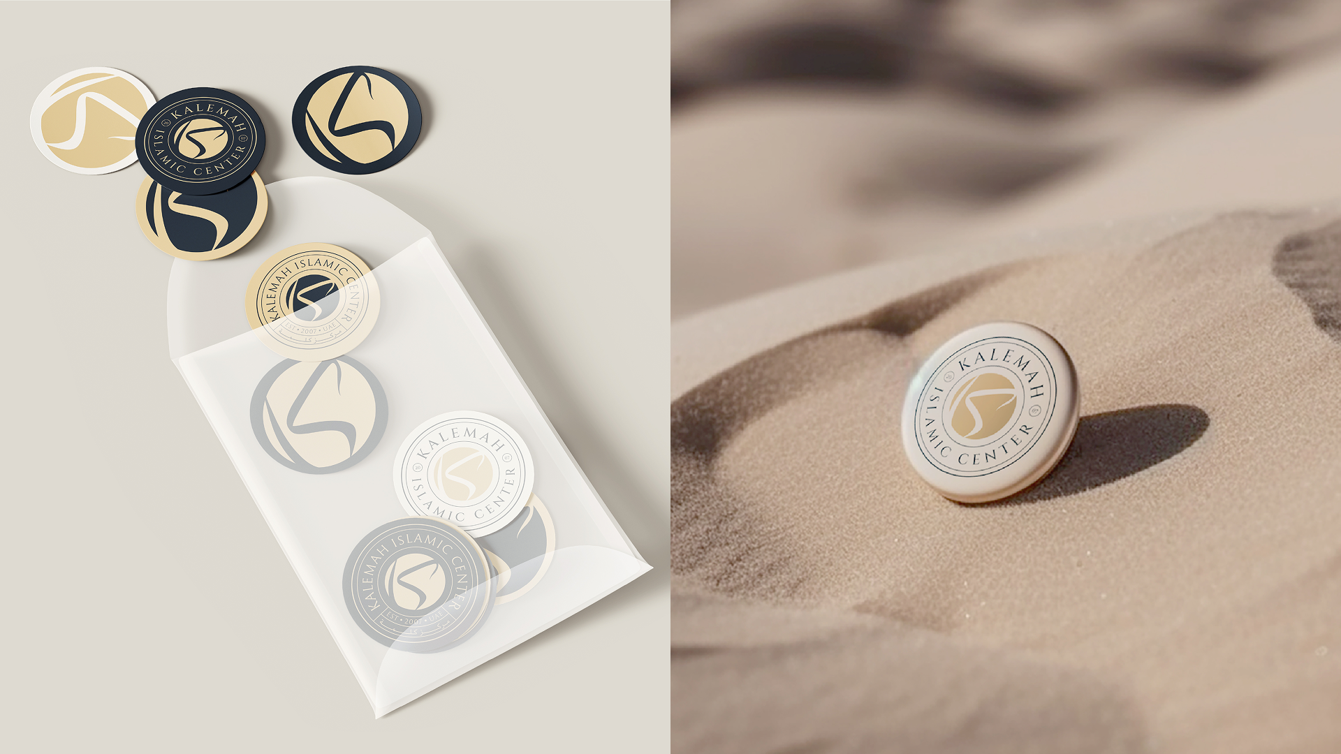
An identity with the quiet confidence of an institution — serene, rooted and unmistakable, from a pin in the sand to a sign on the street.

A 30-minute call. No pitch, no deck — just your idea and how we’d unbox it.