 OUTTA THE BOX™BOOK A FREE CALL█OUTTA THE BOX™BOOK A FREE CALL█
Brand identity & collaterals for a leading online school for Muslim children in grades 3–12 — an aware, educated, spiritually rooted, global community.
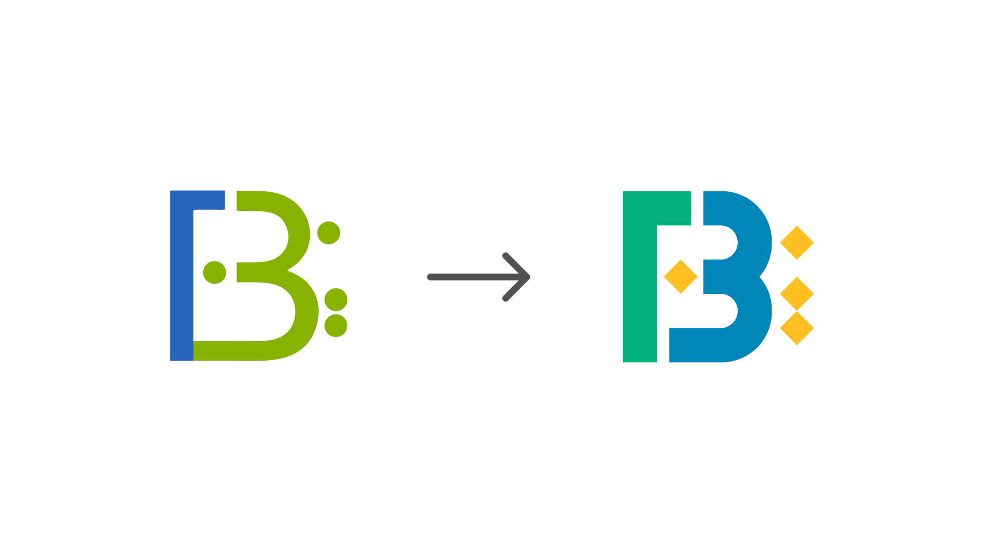
An online school serving 600+ students worldwide, wearing a mark that didn’t match its energy. We rebuilt the B — and gave the brand a system playful enough for kids and credible enough for parents.
Bayaan Academy teaches Muslim children in grades 3–12 across the world — 600+ students, 50+ teachers, and a mission to raise an aware, educated, spiritually rooted global community. But the old identity was flat and dated: it neither sparked the curiosity of children nor carried the credibility parents look for in a school.
The brand speaks to two audiences at once: kids who need learning to feel joyful, and parents who need it to feel trustworthy and rooted in faith. The visual language had to hold both — playful without being childish, Islamic without being solemn.
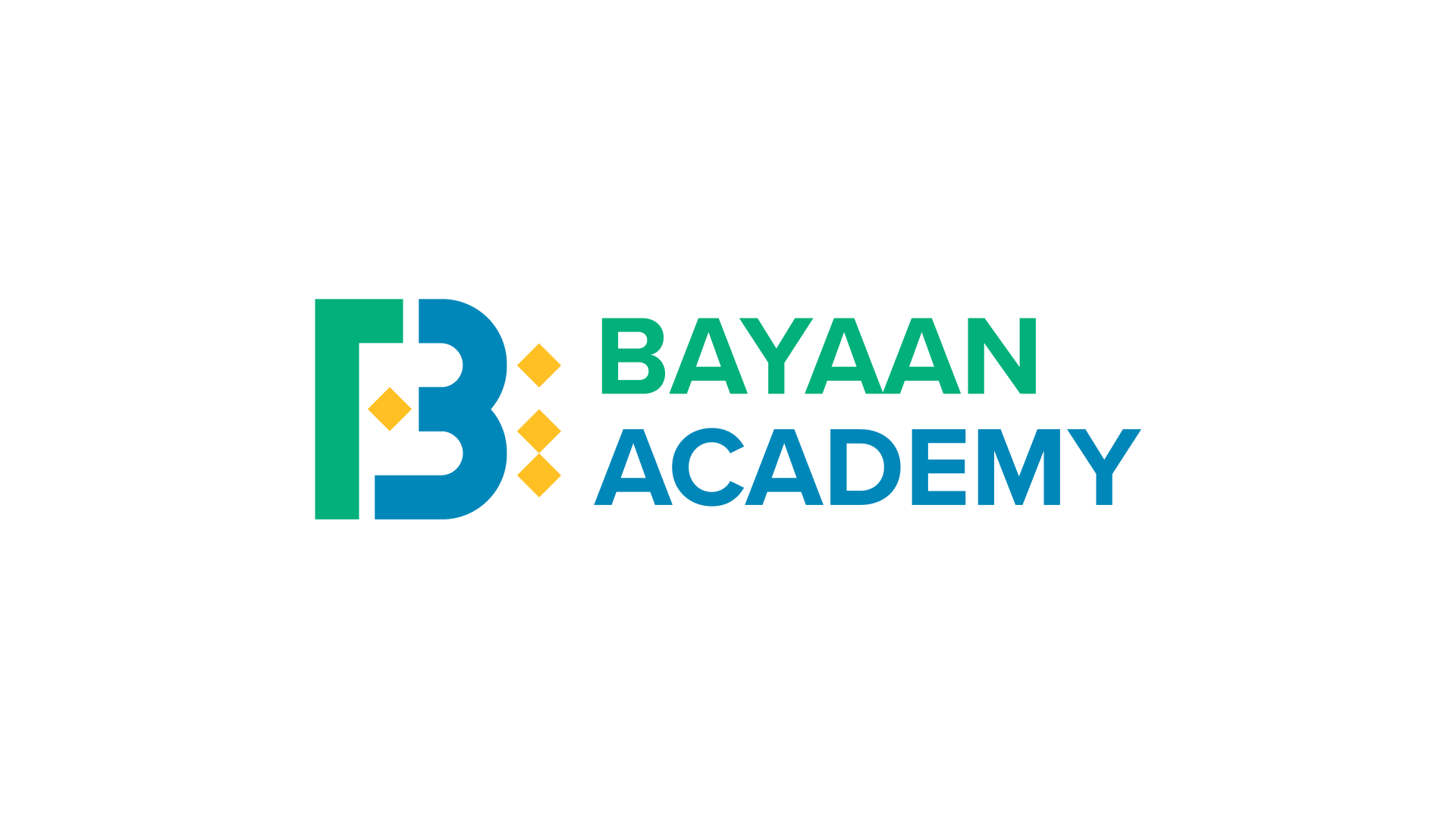
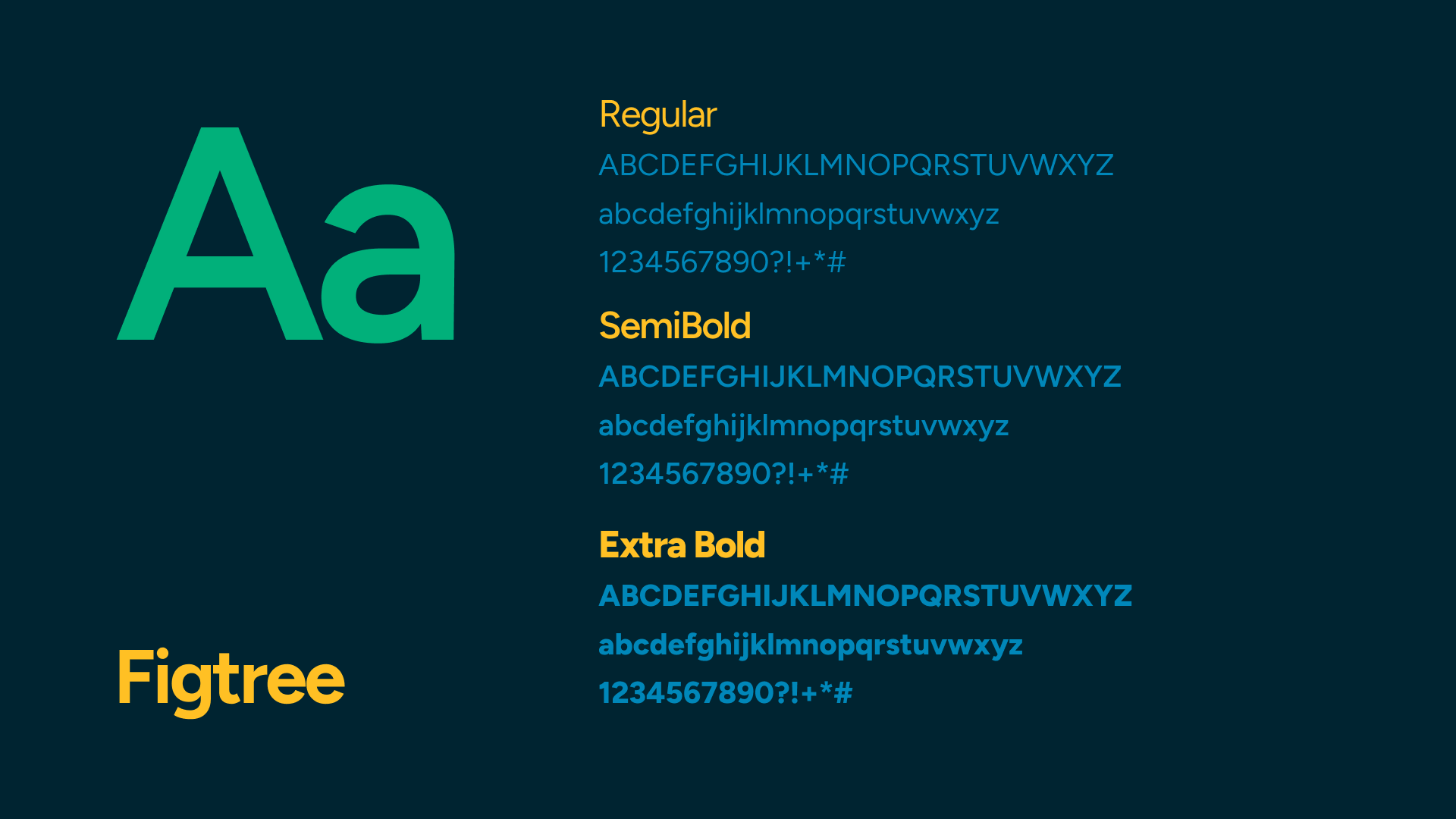
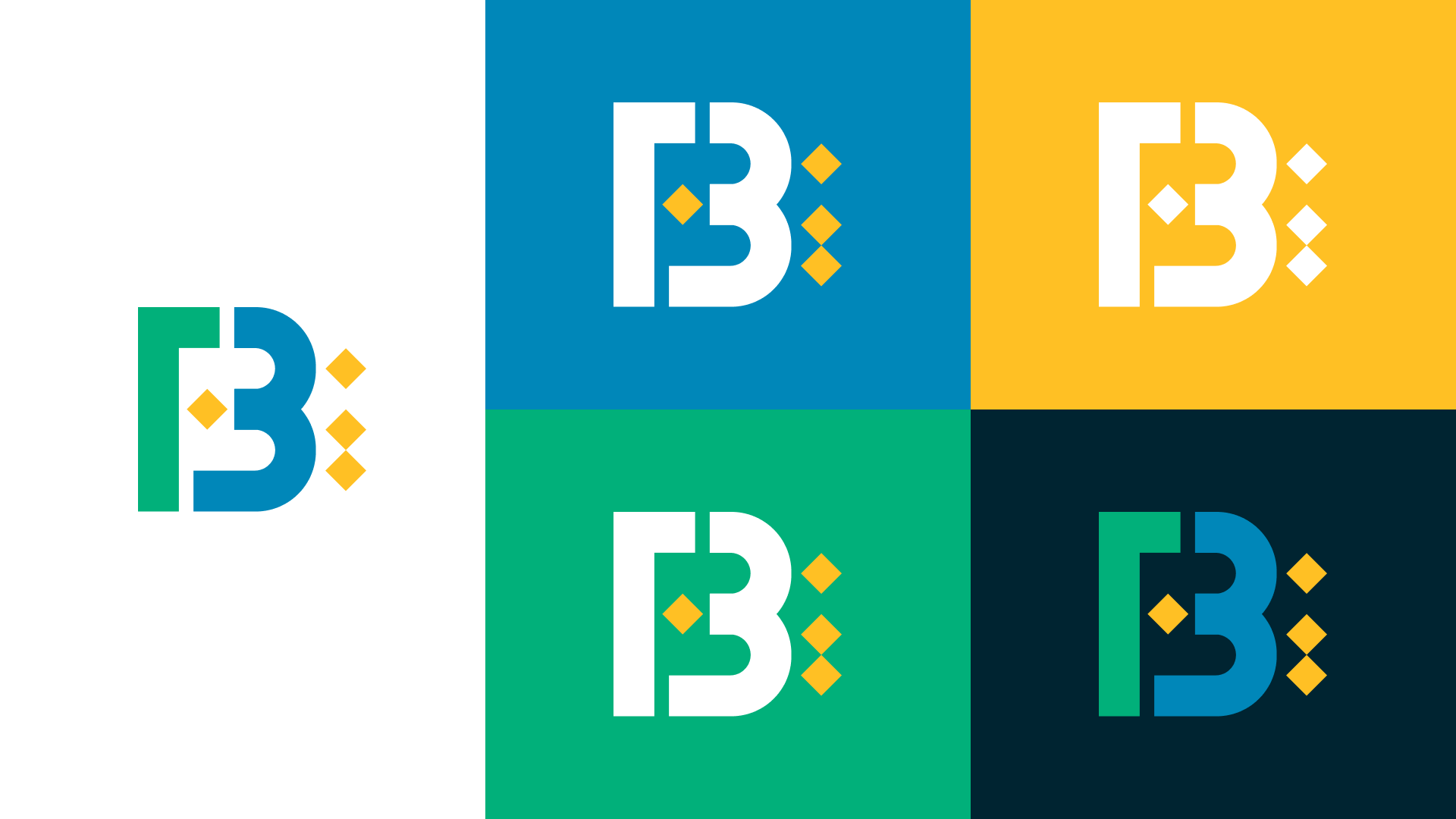
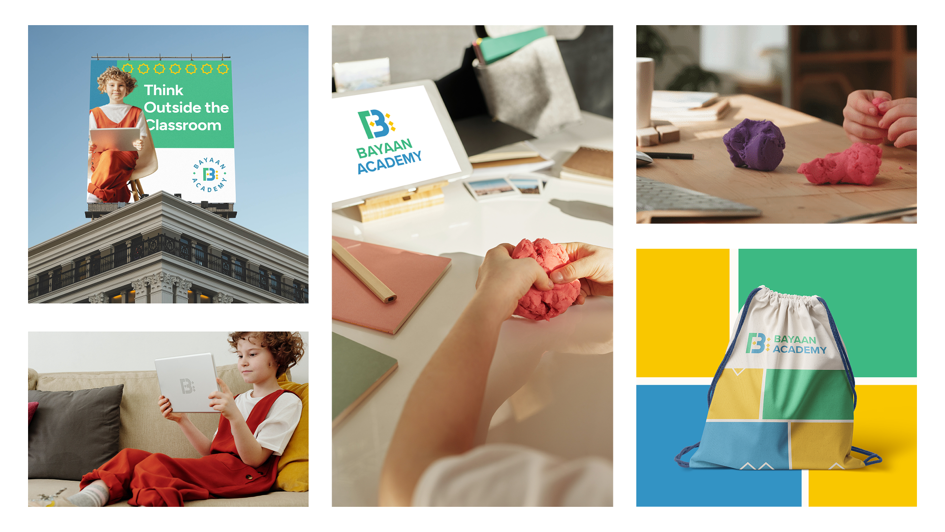
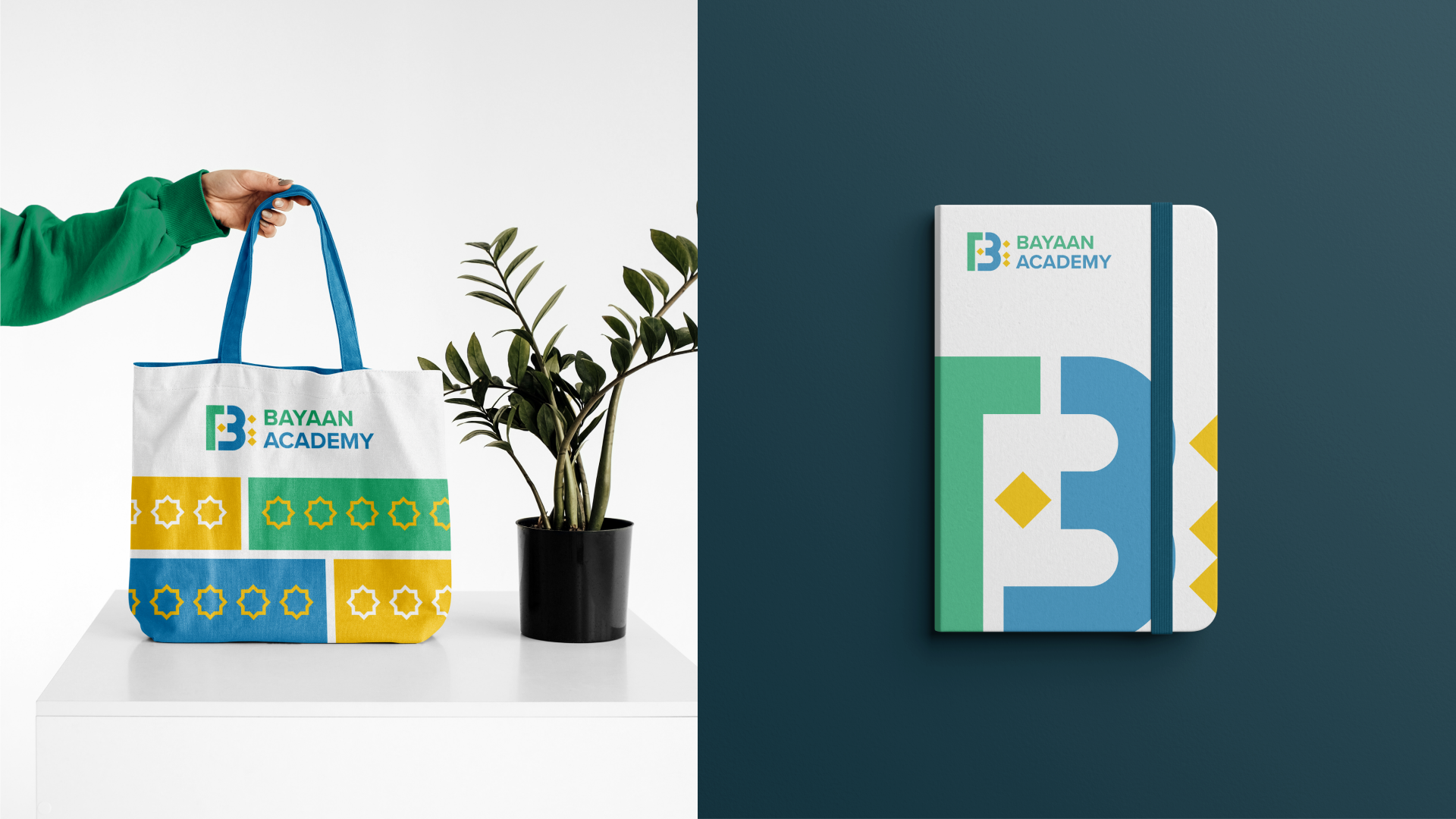
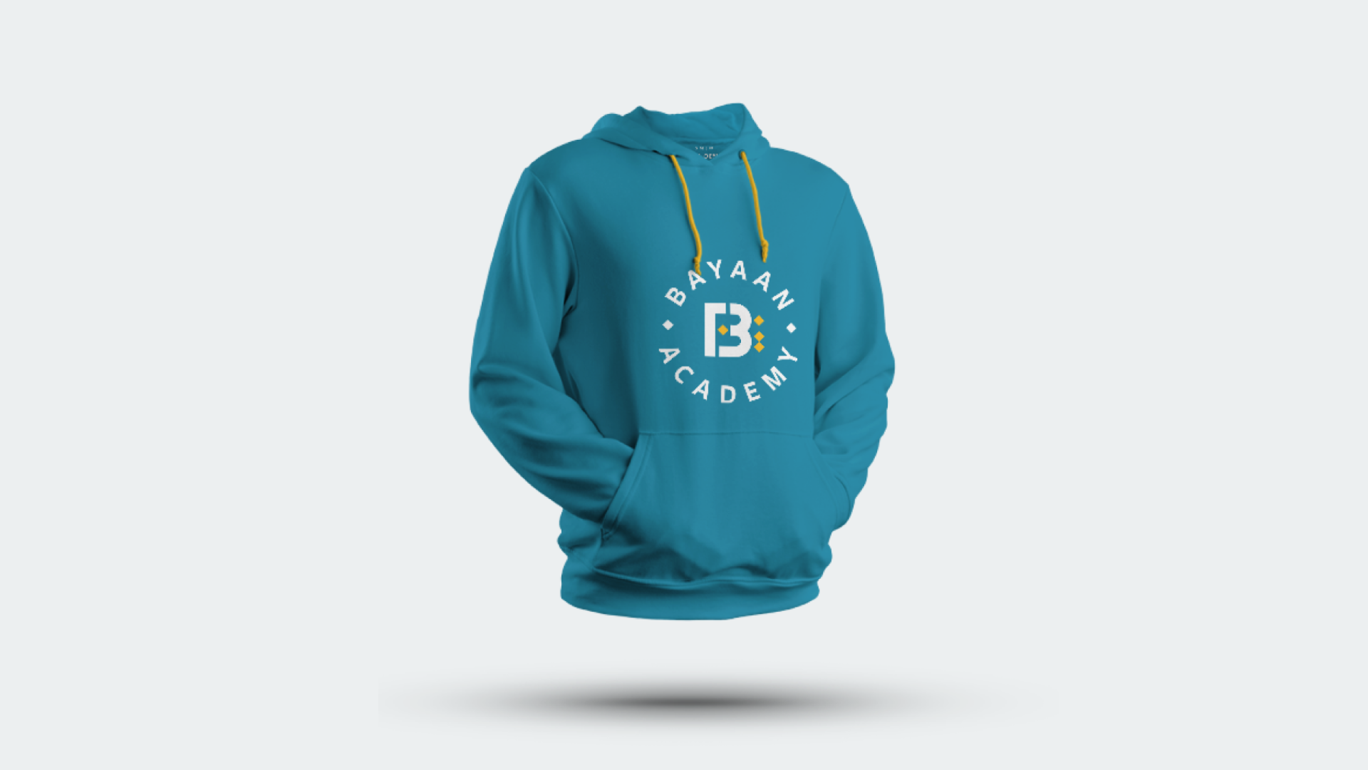
We sharpened the B into a confident, modular mark with the Arabic word “Bayaan” (بيان) built into its negative space — two languages in one letter. Green and blue interlocking forms are accented by golden diamonds drawn from Islamic geometric patterns; the mark doubles as a frame for real students, and the motif scales into patterns, campaigns and collateral. Figtree, warm and legible, carries the voice.
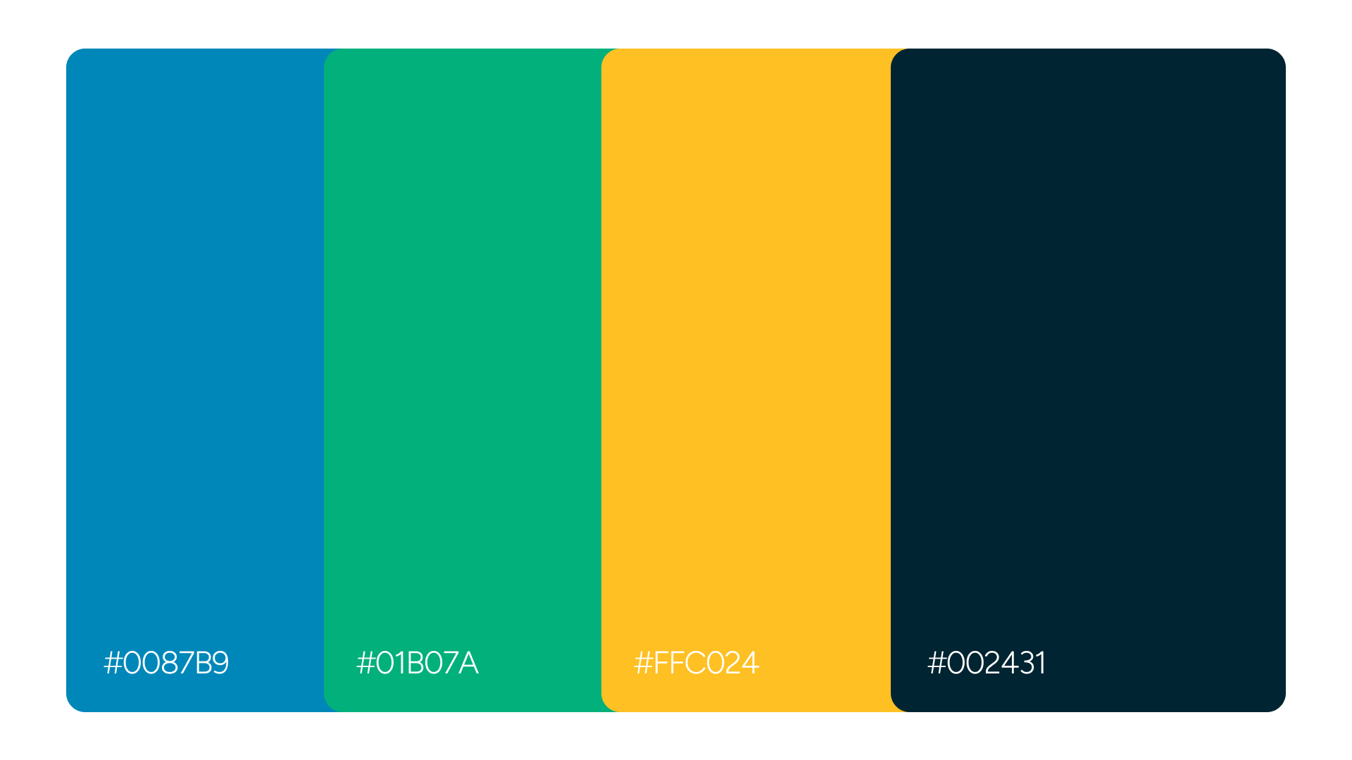
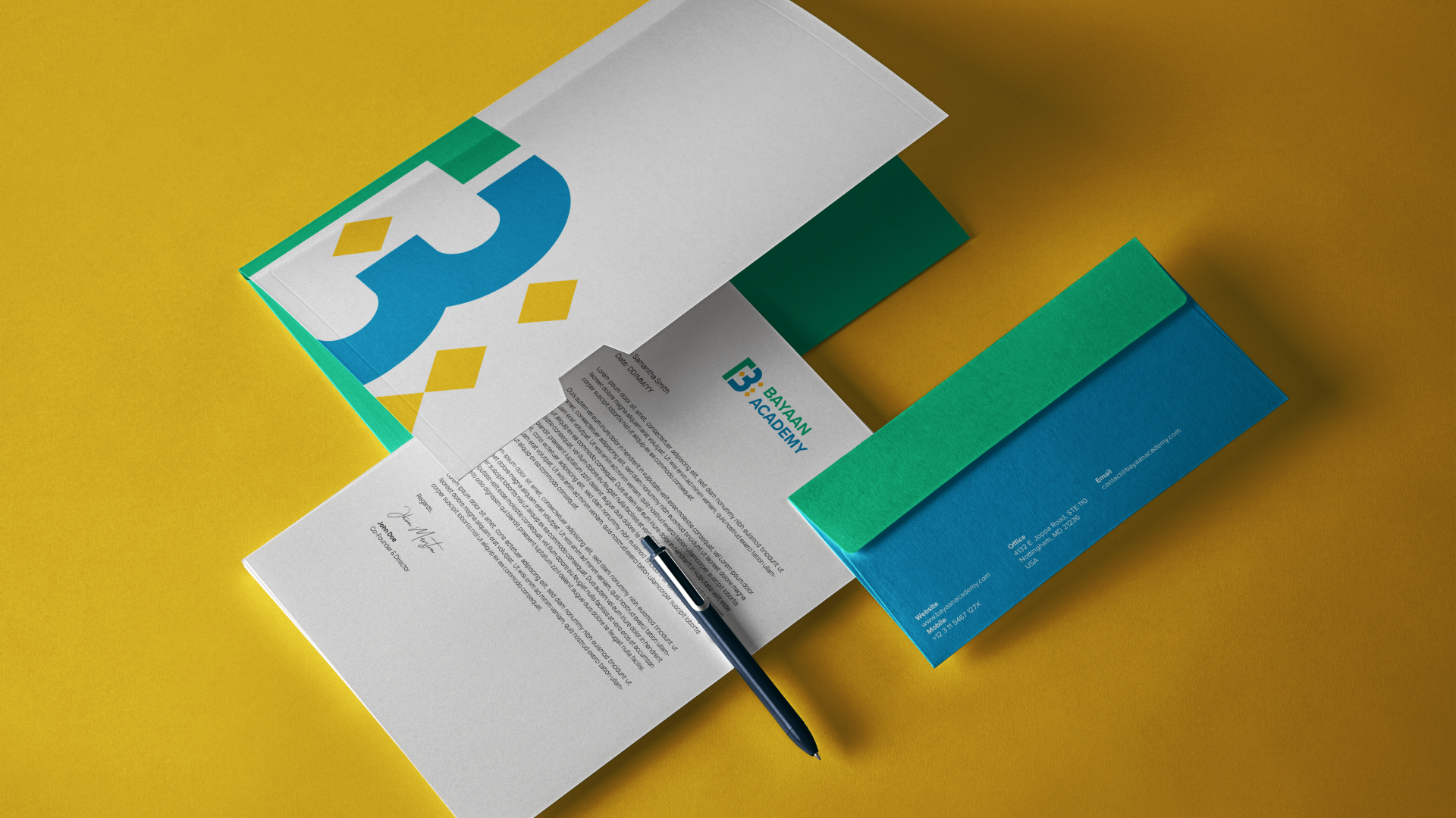
A four-colour system — blue, green, gold on deep teal — deployed across stationery, notebooks, totes, hoodies, billboards and the enrolment website: one world, from classroom to campaign.
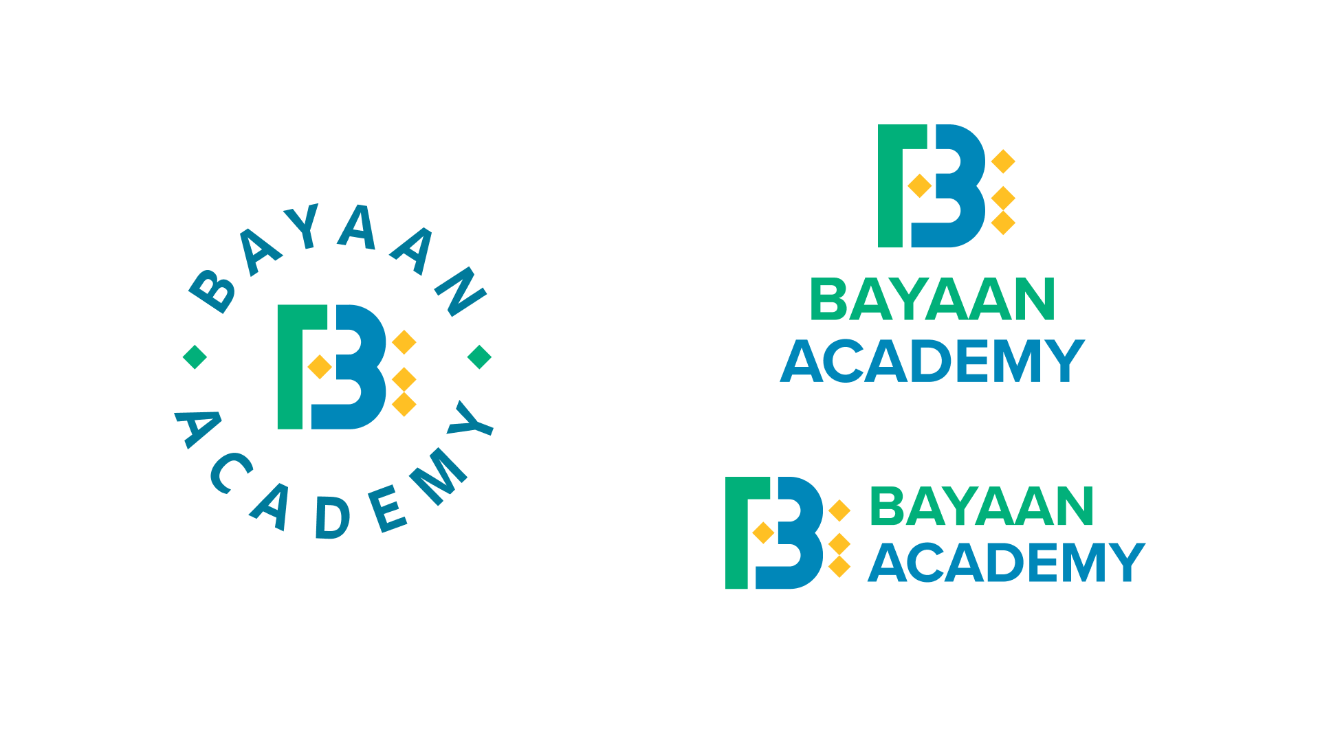
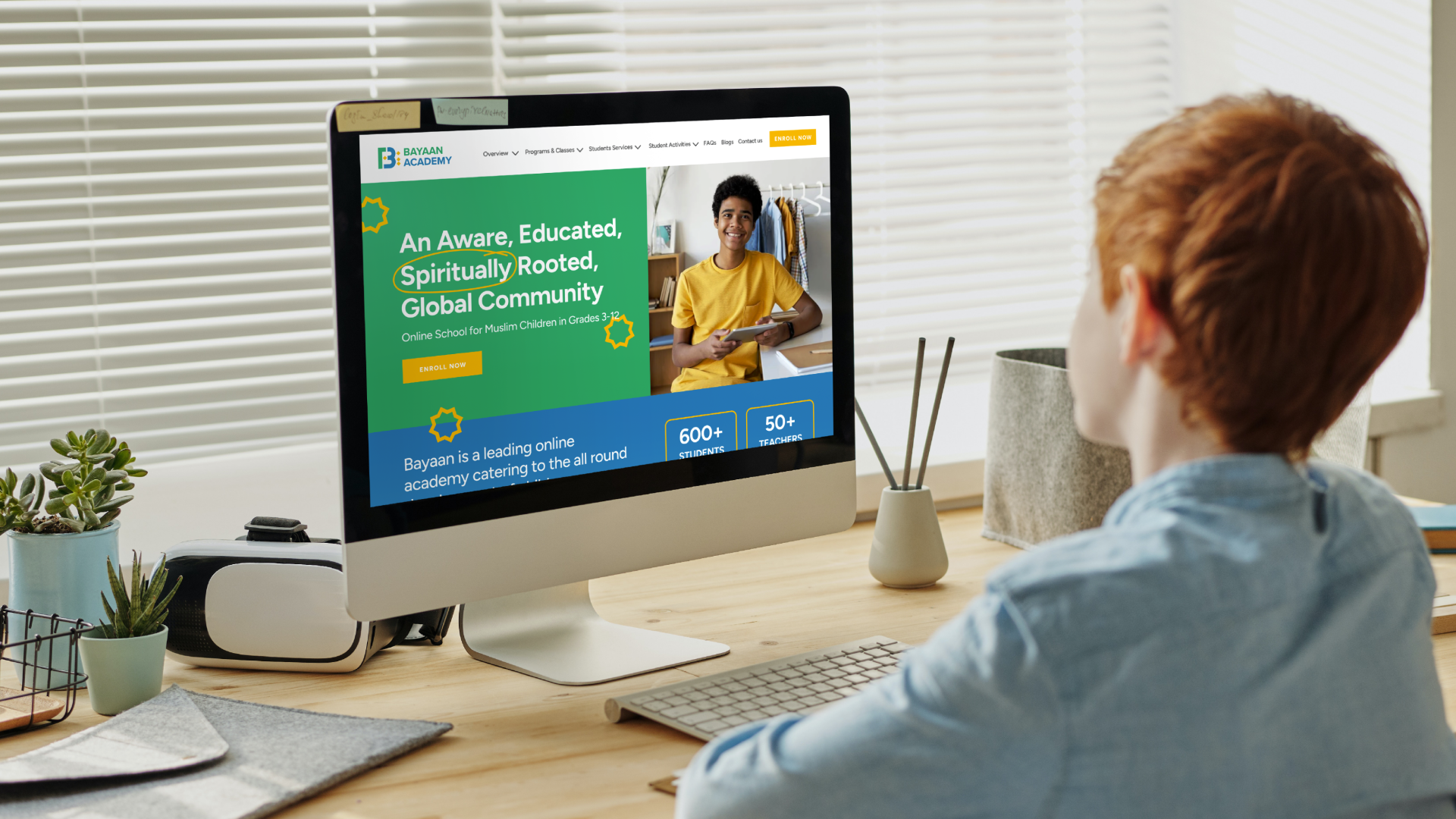
A cohesive identity that finally matches the school’s ambition — joyful to a nine-year-old, credible to their parents, and consistent across every touchpoint from letterhead to billboard.
A 30-minute call. No pitch, no deck — just your idea and how we’d unbox it.